Phone:
(701)814-6992
Physical address:
6296 Donnelly Plaza
Ratkeville, Bahamas.
Phone:
(701)814-6992
Physical address:
6296 Donnelly Plaza
Ratkeville, Bahamas.
Blue remains one of the most versatile and psychologically calming colors for interior spaces, especially living rooms where relaxation meets functionality. Whether a homeowner gravitates toward crisp navy, soft powder blue, or bold cobalt, incorporating blue wall decor offers a straightforward way to refresh a living room without committing to a full furniture overhaul. Unlike trendy accent colors that fade quickly, blue has staying power, it pairs effortlessly with neutrals, warms, and metallics. This guide walks through seven practical approaches to blue wall decor, from paint and paneling to art and accessories, helping DIYers make informed choices that align with their space, budget, and skill level.
Blue’s effectiveness in living rooms is rooted in both color psychology and design versatility. Studies consistently show that blue tones lower heart rate and reduce stress, ideal for a space designed for unwinding after work or hosting guests. Unlike warmer hues that can visually shrink a room, cooler blues tend to recede, making smaller living rooms feel more open.
From a practical standpoint, blue acts as a neutral bridge. It complements existing wood tones, whether oak flooring or walnut furniture, without clashing. Metallic finishes, brass, chrome, brushed nickel, pop against blue backdrops, giving hardware and lighting fixtures more visual weight. Unlike stark white or beige, blue provides depth without overwhelming pattern-heavy textiles or busy bookshelves.
Blue also plays well across design styles. Coastal and nautical themes are obvious fits, but deep navy anchors modern minimalist spaces, while soft periwinkle suits farmhouse or cottage aesthetics. Homeowners aren’t locked into a single decorating lane when they choose blue, which matters for long-term satisfaction and resale appeal.
Selecting the correct blue shade depends on natural light, ceiling height, and the room’s existing color palette. Navy and deep indigo work best in living rooms with abundant natural light or high ceilings above 9 feet. These darker tones absorb light, so in dimly lit spaces they can feel cave-like rather than cozy. Pair navy with white trim and light-colored furniture to maintain balance.
Powder blue and sky blue suit smaller living rooms or spaces with limited windows. These airy shades reflect available light and visually expand square footage. They’re forgiving with undertones, most powder blues lean slightly gray or green, which helps them mesh with existing beige or cream elements.
Cobalt and royal blue deliver high contrast and energy, ideal for modern or eclectic interiors. These saturated hues demand commitment: they pair best with crisp whites, charcoal grays, or natural wood rather than competing warm tones like terracotta or burnt orange.
Teal and turquoise occupy the blue-green spectrum. They bring warmth that pure blues lack, making them versatile in transitional spaces. Teal reads sophisticated in living rooms with mixed metal finishes and layered textures like velvet or linen.
Test shades with sample pots on poster board, not directly on walls. Move the samples around the room throughout the day to see how morning, midday, and evening light shifts the color’s appearance. This step prevents costly repainting when a shade looks drastically different once an entire wall is covered.
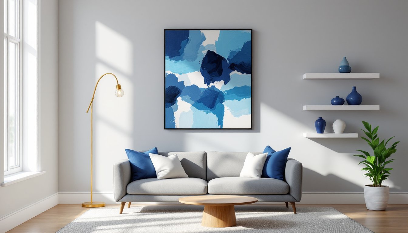
Large-scale art offers immediate impact without the permanence or labor of paint. Canvas prints in abstract blue patterns or seascapes anchor a living room’s focal wall, typically the wall behind the sofa or opposite the main entry. Standard sizes like 36″ × 48″ or 40″ × 60″ work for walls spanning 10 to 14 feet, maintaining proper scale.
When selecting prints, consider the room’s undertones. Cool-toned living rooms (gray, white, silver) pair well with pure blues and blue-violets. Warm-toned spaces (beige, cream, gold) benefit from artwork that incorporates teal, turquoise, or blue with hints of rust or amber to tie the palette together.
Gallery walls allow mixing blue artwork with black-and-white photography or neutral prints. Aim for at least 40% of the gallery to feature blue elements to maintain visual cohesion. Use a level and painter’s tape to mock up frame placement before hammering nails, a 2-3 inch gap between frames creates breathing room without excessive spacing.
For textured options, fabric wall hangings or woven tapestries in indigo or batik patterns add dimension that flat prints lack. These work particularly well in bohemian or global-inspired living rooms. Mount them using a wooden dowel and picture wire, or attach Velcro strips to the back and wall for damage-free hanging in rentals.
An accent wall concentrates color impact without committing an entire room. For painted accent walls, one gallon of quality paint (covering roughly 350-400 square feet) suffices for most standard 12′ × 12′ walls. Use a low-VOC or zero-VOC formula to minimize odor and off-gassing, especially in high-traffic living areas.
Prep matters: fill nail holes with spackling compound, sand smooth with 120-grit sandpaper, and apply primer if covering a darker existing color or working with new drywall. Two coats deliver even coverage, cutting corners here leads to streaking and visible roller marks.
Peel-and-stick wallpaper has improved dramatically in adhesion and pattern quality. Removable options work well for renters or commitment-phobic homeowners. Patterns like navy geometric, watercolor blue florals, or textured linen-look papers add visual interest beyond flat paint. Measure the wall’s square footage and order 10-15% extra to account for pattern matching and trimming. A smoothing tool and sharp utility knife are essential, bubbles and crooked seams ruin the effect.
Board-and-batten or shiplap paneling painted in blue tones introduces architectural detail. This approach suits farmhouse, coastal, or transitional styles. Use 1×4 or 1×6 boards (actual dimensions ¾” × 3½” or ¾” × 5½”) spaced evenly and attached to wall studs with a finish nailer or construction adhesive. Paint the paneling and wall the same blue shade for a cohesive look, or paint the paneling white with a blue wall behind for contrast. This is a weekend project requiring basic carpentry skills, a miter saw for clean cuts, and a stud finder to ensure secure attachment.
Smaller accessories allow testing blue without major investment or labor. Floating shelves in natural wood or white, styled with blue pottery, vases, or books, bring vertical interest and functional display space. Install shelves into studs using appropriate anchors, toggle bolts for drywall or wood screws for stud mounting, to support weight safely.
Wall sconces with blue glass shades or ceramic bases add both decor and task lighting. Position them 60-66 inches from the floor on either side of artwork or a mirror. If the living room lacks existing electrical boxes, battery-operated or plug-in sconces eliminate the need for hiring an electrician.
Mirrors with blue frames, painted wood, lacquered resin, or mosaic tile, reflect light and visually expand space. A large mirror (30″ × 40″ or bigger) works above a console table or mantel. Ensure proper wall anchoring: mirrors are heavy and require heavy-duty picture hooks rated for the frame’s weight.
Decorative plates or wall baskets arranged in clusters inject texture and color. Blue ceramic plates in varying sizes (8″ to 14″ diameter) mounted with plate hangers create an organic, layered look. Similarly, woven indigo-dyed baskets from African or Asian markets add global flair and three-dimensional depth.
Clocks, metal wall sculptures, or macramé in blue hues round out accessory options. Keep the scale appropriate, small accents get lost on large blank walls, while oversized pieces overwhelm tight spaces.
Blue wall decor functions best when it’s part of a coordinated palette rather than an isolated element. Neutral furniture, gray sofas, cream armchairs, natural wood coffee tables, provides a grounding base that lets blue take center stage without visual chaos. Avoid matching blue furniture to blue walls in the exact same shade: it flattens depth and reads monotone. Instead, layer different blue tones or contrast with warm neutrals.
Textiles tie the room together. Throw pillows, area rugs, and curtains should pull one or two shades from the blue wall decor. For example, if the wall features navy art, incorporate navy and lighter blue pillows alongside cream or tan accents. An area rug with blue patterns anchors seating areas and defines zones in open-concept spaces.
Metallics add polish. Brass and gold bring warmth that offsets cooler blues, while chrome and silver reinforce modern, crisp aesthetics. Light fixtures, picture frames, and hardware (drawer pulls, curtain rods) in consistent metallic finishes unify the look.
Greenery provides natural contrast. Potted plants or fresh-cut flowers in white or neutral ceramic planters break up blue’s cool dominance and introduce organic shapes. Consider fiddle-leaf figs, snake plants, or eucalyptus branches for low-maintenance options.
Balance is key: if the wall decor is bold (saturated blue paint or busy wallpaper), keep furniture and textiles simpler. Conversely, subtle blue accents can handle more pattern and texture elsewhere in the room.
Blue wall decor transforms living rooms through a range of approaches, from commitment-heavy paint projects to renter-friendly art and accessories. Success hinges on matching the blue shade to the room’s light and style, prepping surfaces properly, and balancing bold elements with neutral anchors. Homeowners who take time to test samples, measure accurately, and consider the full palette will end up with a cohesive, livable space that stands the test of time.