Phone:
(701)814-6992
Physical address:
6296 Donnelly Plaza
Ratkeville, Bahamas.

Phone:
(701)814-6992
Physical address:
6296 Donnelly Plaza
Ratkeville, Bahamas.
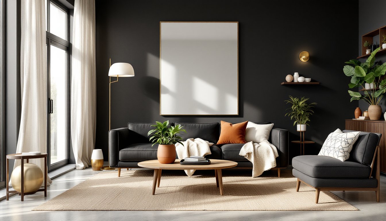
Black living rooms aren’t what they used to be. Gone are the days when painting a room dark meant making it feel like a cave. Today’s homeowners are discovering that black decor, when done right, creates depth, drama, and a level of sophistication lighter palettes can’t touch. The trick lies in understanding how to balance intensity with warmth, texture with light, and boldness with livability. This guide walks through proven techniques for creating a black living room that feels curated and intentional, not oppressive. From wall treatments to furniture choices and the accents that tie it all together, these ideas deliver visual impact without sacrificing comfort.
The shift toward black interiors reflects a broader move away from the all-white aesthetic that dominated the 2010s. Homeowners are craving richness and character, and black delivers both.
Matte black paint finishes like Sherwin-Williams’ Tricorn Black or Benjamin Moore’s Black have surged in popularity because they absorb light rather than reflect it, creating a velvety backdrop that makes furnishings pop. Unlike gloss finishes, matte doesn’t highlight wall imperfections, a practical bonus in older homes.
The trend also ties into sustainability. Dark colors hide wear and dirt better than white, meaning less frequent repainting. For high-traffic living rooms, that’s a real advantage. Plus, black anchors mixed-material spaces, think reclaimed wood beams, concrete floors, and steel fixtures, without competing visually.
Social media has played a role, too. Black rooms photograph dramatically, especially with natural light streaming in. But beyond the Instagram appeal, designers note that clients are simply tired of playing it safe. Black reads as confident, especially when paired with quality materials and thoughtful lighting.
Painting all four walls black can work, but only if the lighting strategy is solid. Layered lighting, ambient, task, and accent, is non-negotiable.
Start with recessed LED downlights on a dimmer. Aim for 4–6 fixtures in a standard 12×15-foot living room, spaced evenly to eliminate dark corners. Color temperature matters: 2700K warm white prevents the space from feeling clinical.
Add floor lamps or table lamps with white or linen shades to bounce light off surfaces. Avoid dark lampshades, they defeat the purpose. Wall sconces positioned 60–66 inches from the floor (standard eye level) create visual interest and highlight texture.
Texture is the second critical piece. Flat black drywall alone looks unfinished. Consider these options:
Mirrors amplify light. A large-format mirror (at least 36×48 inches) opposite a window reflects daylight and visually doubles the room’s brightness. Frame it in brass or natural wood to soften the effect.
Window treatments matter. Sheer white or cream linen curtains filter light without blocking it. If privacy is needed, layer them over blackout shades that can be raised during the day.
Black furniture works best when it has presence, either through scale, material, or silhouette.
Black leather sofas are the workhorse choice. Full-grain leather ages well and develops a patina: top-grain is more affordable but less durable. A sectional in black leather grounds the room without overwhelming it, especially in open-concept layouts.
For a softer look, charcoal or black velvet upholstery adds luxury. Velvet catches light differently depending on the nap direction, creating subtle visual movement. It’s not the most practical for homes with kids or pets, though, spills show, and it requires regular brushing.
Black wood furniture, ebonized oak, black-stained walnut, or painted hardwood, brings warmth that black metal can’t. A black media console with visible wood grain or a black coffee table with a matte lacquer finish anchors the seating area. Look for pieces with interesting joinery or leg profiles: simple rectangles can read as bland.
Metal furniture in black works in industrial or modern spaces. Powder-coated steel shelving or a black iron side table adds structure. Just don’t overdo it, too much metal makes a room feel cold.
Avoid matching sets. Mix a black sofa with a charcoal armchair and a black-and-white patterned ottoman. Variation in tone and texture keeps the palette from feeling flat.
Black alone can feel austere. Warm metallics and natural materials break that up.
Brass and bronze are the go-to metals for black rooms. They’ve got warmth that nickel and chrome lack. Consider:
Don’t mix more than two metal finishes in one room. Brass and matte black is a classic pairing: adding chrome or copper muddies the look.
Natural wood tones, especially medium to light woods, add life. A white oak coffee table, walnut floating shelves, or a teak credenza provides organic contrast. Avoid dark walnut or espresso finishes: they disappear against black walls.
Live plants are essential. Black absorbs light, so choose low-light tolerant species like pothos, snake plants, or ZZ plants. Use ceramic or terracotta planters in cream, rust, or natural clay. The irregular shapes and earth tones soften the hard edges.
Natural fiber rugs, jute, sisal, or wool in oatmeal or taupe, ground the space and add tactile warmth. A 9×12-foot area rug in a standard living room should extend at least 18 inches beyond the front legs of the sofa and chairs.
Layering in these elements prevents the room from reading as one-note. The goal is visual relief, not overthinking it.
Black is neutral, but it’s a strong one. The right accent colors keep the palette from feeling heavy.
White and cream are the safest choices. A white or off-white sofa against black walls creates high contrast without harshness. Use warm whites (Benjamin Moore’s White Dove or Sherwin-Williams’ Alabaster) rather than stark, cool whites, which can feel sterile.
Warm earth tones, terracotta, ochre, burnt sienna, add richness. Throw pillows, blankets, or artwork in these shades introduce color without overwhelming the black base. A rust-colored velvet pillow or terracotta ceramic vase brings warmth.
Deep jewel tones work surprisingly well. Emerald green, sapphire blue, or burgundy in small doses, an accent chair, a piece of art, or a rug, create sophistication. These colors have enough weight to hold their own against black.
Blush pink or dusty rose might sound counterintuitive, but they soften black’s intensity. A blush throw blanket or rose-toned artwork adds unexpected warmth without going feminine.
Avoid bright, saturated colors like primary red or electric blue unless the goal is a gallery-like, high-contrast space. In most living rooms, they’ll feel jarring.
Stick to a 60-30-10 rule: 60% black (walls, major furniture), 30% neutral (white, cream, wood), and 10% accent color. It keeps the palette cohesive without becoming monotonous.
An all-black or near-black room lives or dies by its layering. Without variation in pattern and material, it reads flat.
Start with textural contrast. Pair smooth with rough, soft with hard:
Pattern introduces visual interest without color. Options include:
Avoid busy patterns. In a dark room, too much pattern competes for attention. Stick to one or two patterned elements and keep the rest solid or tonal.
Material variety is key. Mix at least three to four different materials:
Sheen variation matters, too. A room with all matte finishes feels flat: all glossy feels harsh. Mix matte walls with satin-finish furniture, a polished metal lamp, and a soft, napped rug.
Layering takes restraint. The goal isn’t to fill every surface but to create enough variation that the eye finds something new with each glance. Edit ruthlessly, black shows clutter more than lighter palettes do.
Black living rooms demand intention. They don’t forgive poor lighting, flat surfaces, or clutter. But when executed with attention to texture, light, and material variety, they deliver a sophistication that safer palettes can’t match. Start with one black element, a feature wall, a sofa, or a rug, and build from there. The room will tell you when it’s balanced.