Phone:
(701)814-6992
Physical address:
6296 Donnelly Plaza
Ratkeville, Bahamas.

Phone:
(701)814-6992
Physical address:
6296 Donnelly Plaza
Ratkeville, Bahamas.
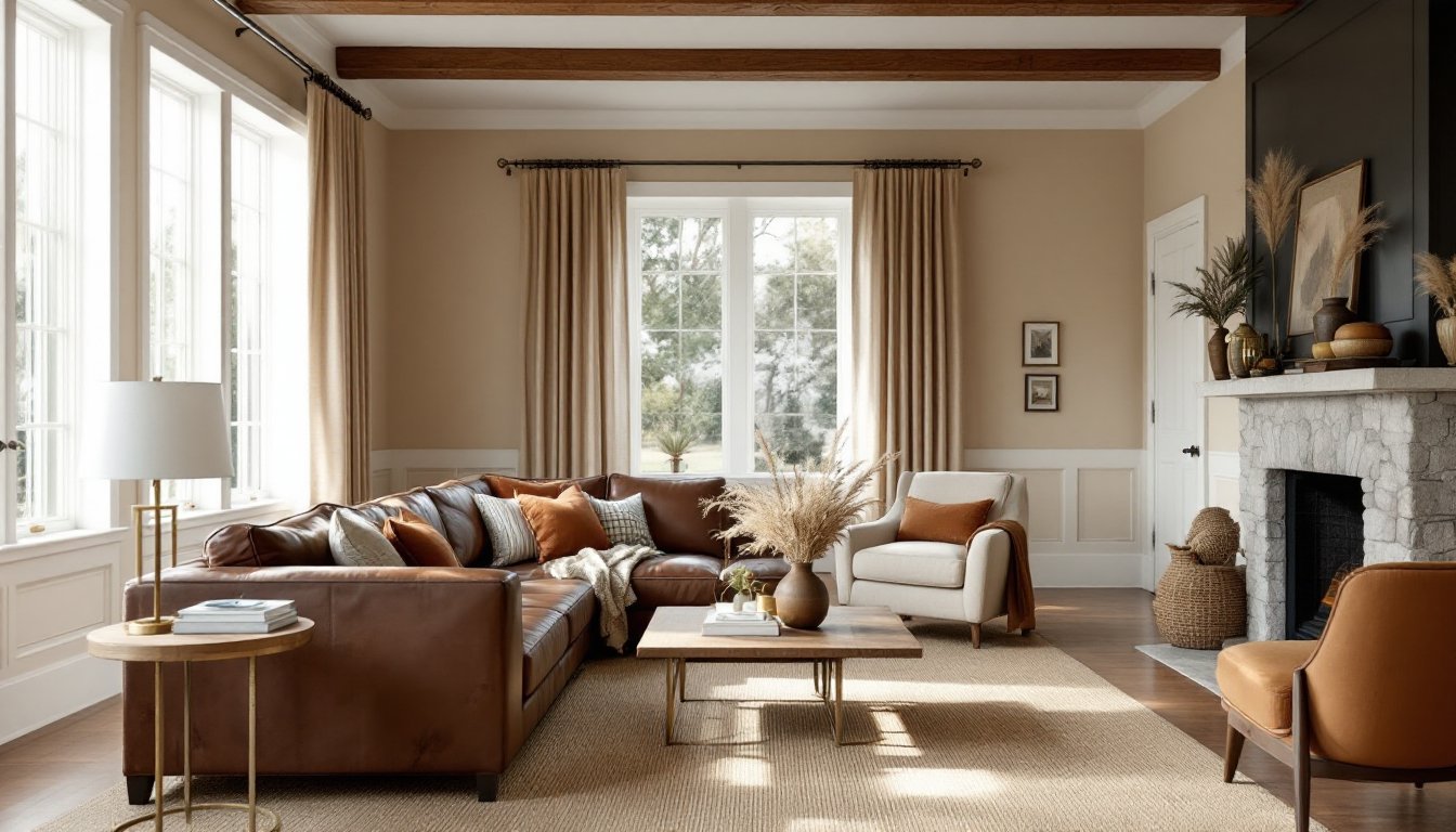
Brown living room decor has earned its place as a timeless design choice, but it’s far from boring. When done right, brown creates spaces that feel grounded, inviting, and surprisingly versatile. Unlike stark whites or trendy grays, brown brings warmth without sacrificing sophistication, it’s the color equivalent of a well-built hardwood floor that improves with age. Whether someone’s working with existing wood trim, leather furniture, or just tired of cold-toned rooms, brown offers a foundation that pairs with nearly everything. This guide walks through shade selection, color pairings, furniture strategies, and material choices to help anyone build a brown living room that feels intentional, not accidental.
Brown functions as a chameleon neutral because it exists naturally in wood, stone, leather, and clay, materials humans have built with for millennia. This organic familiarity makes brown living room decor feel inherently comfortable rather than forced.
Unlike pure neutrals like white or gray, brown carries warmth without needing additional heat sources in the palette. It grounds a space visually, much like how a foundation anchors a structure. Rooms with brown elements tend to photograph well in varied lighting because the color absorbs and reflects light differently throughout the day, preventing the flatness that sometimes plagues all-white interiors.
From a practical standpoint, brown hides wear better than lighter neutrals. A chocolate brown sofa won’t show every coffee spill the way cream linen does, and medium brown wood floors camouflage dust and minor scratches between refinishing cycles. For households with kids, pets, or heavy foot traffic, this durability matters as much as aesthetics.
Brown also plays well with existing architectural features. Homeowners stuck with oak trim from the ’90s or walnut built-ins don’t have to fight against them, they can lean into brown palettes that make those elements look intentional rather than dated.
Taupe, camel, and sand tones work best in rooms with limited natural light or smaller footprints. These shades reflect more light than darker browns, preventing cave-like atmospheres in basement living rooms or north-facing spaces.
Light brown works particularly well on walls when paired with white trim, it creates definition without stark contrast. A warm beige on drywall can make 8-foot ceilings feel taller by blending wall and ceiling planes subtly. Paint coverage typically runs 350–400 square feet per gallon for quality latex in these shades: lighter colors often need fewer coats than deep tones.
For furniture, linen-colored upholstery or light oak pieces keep the palette open. These shades pair naturally with cream, soft gray, and muted pastels without competing. They’re forgiving backdrops for homeowners who like to swap accent colors seasonally.
One caution: very light browns can read as dingy if the undertone skews too gray or green. Test samples in the room’s actual lighting, morning and evening, before committing to a full wall.
Deep browns, chocolate, espresso, or dark walnut stain equivalents, add architectural weight and sophistication but require careful handling. These shades work best in rooms with ample natural light or high ceilings, where they can create coziness without claustrophobia.
A single accent wall in dark brown behind a fireplace or media console can anchor a room without overwhelming it. Full-room applications demand balance: if walls go dark, keep trim, ceilings, and large furniture pieces lighter to maintain visual breathing room.
Dark brown leather furniture ages beautifully, developing patina that lighter materials can’t match. A quality leather sofa in espresso will last 15–20 years with proper conditioning, making it a sound long-term investment even though higher upfront costs.
These tones also hide imperfections in older plaster or drywall better than light colors. Minor cracks and texture variations disappear under deep brown paint, reducing prep work compared to crisp white finishes that highlight every flaw.
Brown and cream remains the classic pairing, think of it as the interior equivalent of a well-joined mortise and tenon. Cream softens brown’s earthiness while maintaining warmth. Use cream for larger elements like sofas or curtains, brown for wood furniture and accent pieces.
Brown with blue creates balance between warm and cool. Navy or slate blue grounds brown’s warmth without clashing, particularly effective in rooms with cool-toned flooring like gray luxury vinyl plank (LVP) or bluestone tile. Dusty blue velvet pillows on a tan sofa hit this balance cleanly.
Brown and green taps into natural outdoor palettes. Sage, olive, or forest green works alongside brown in spaces with wood beams or stone fireplaces. This combination works particularly well in rooms with large windows overlooking greenery, it extends the outdoor palette inside.
Brown with terracotta or rust intensifies the warm, earthy feel. These colors share undertones, creating a layered monochromatic effect. This pairing suits Southwestern or Mediterranean design schemes. Clay-colored throw blankets or rust linen curtains add depth without introducing conflicting color temperatures.
Brown and white provides maximum contrast for those wanting brown’s warmth with crisp definition. White shiplap or trim against brown walls creates farmhouse or transitional aesthetics. Keep the brown on the warmer side (caramel rather than taupe) to prevent the white from looking institutional.
Accent metals matter here too. Warm brass or copper hardware and light fixtures complement brown better than chrome or brushed nickel, which can read cold against brown’s warmth.
Start with one substantial brown anchor piece, a leather sectional, a solid wood media console, or a large walnut coffee table. This establishes the palette without committing every surface to brown.
For seating arrangements, a brown sofa gains dimension when paired with lighter accent chairs. A tan three-cushion sofa flanked by cream or gray armchairs creates conversational groupings while preventing monotone layouts. Leave at least 36 inches of walking space between furniture pieces for comfortable traffic flow, this standard clearance matters more in brown rooms where visual weight can make spaces feel tighter.
Wood furniture in mixed finishes adds depth. A medium oak bookshelf, a dark walnut side table, and a light ash media stand create layered interest. This works because they share brown as a base but vary in tone and grain pattern, similar to how different lumber species contribute to a well-designed built-in.
For smaller rooms, keep brown furniture lower to the ground. A low-profile sectional (seat height around 17–18 inches instead of standard 19–20 inches) in chocolate brown maintains warmth without blocking sightlines. Pair it with a glass or acrylic coffee table to preserve visual openness.
Avoid pushing all furniture against walls. Floating a brown sofa a few feet from the wall, with a narrow console table behind it, creates dimension and makes the room feel larger. This also allows space for floor lamps, which add necessary task lighting in brown rooms where ambient light can feel absorbed by darker surfaces.
Brown living room decor succeeds or fails based on texture variation. Flat, monochromatic brown reads as dull: layered textures create richness.
Leather brings sheen and ages visibly. Top-grain leather develops character over time, unlike bonded leather that peels after a few years. Condition leather furniture twice yearly with appropriate products to prevent cracking, this maintenance keeps brown leather looking intentional rather than worn.
Natural fiber rugs, jute, sisal, or seagrass, add organic texture underfoot. A 9’x12′ jute rug grounds a seating area in most standard living rooms, providing enough coverage that front furniture legs rest on it. These materials wear well in high-traffic areas and hide dirt effectively, though they can feel scratchy: layer a softer runner or cowhide over them in seating zones if needed.
Linen and cotton textiles soften hard brown surfaces. Linen curtains in oatmeal or cream filter light beautifully while adding movement. Cotton canvas pillow covers in varied brown tones (camel, cocoa, khaki) create visual interest without pattern overload.
Wood ceiling beams, either structural or decorative, bring brown overhead, which balances dark brown floors or furniture. Faux beams made from lightweight polyurethane install easily with construction adhesive and trim-head screws into ceiling joists: they’re a non-structural cosmetic upgrade that adds architectural interest.
Woven elements like rattan chairs, wicker baskets, or bamboo blinds introduce three-dimensional texture. These materials share brown’s earthy roots but provide pattern through weave structure.
Metallic accents in warm finishes, aged brass cabinet pulls, copper light fixtures, or bronze curtain rods, catch light and break up brown’s matte absorption. This prevents the space from feeling too flat or one-note.
Avoid overloading on glossy finishes. One or two shiny elements (a polished wood table, a glazed ceramic lamp) provide enough contrast: too much gloss makes brown spaces feel busy rather than layered.