Phone:
(701)814-6992
Physical address:
6296 Donnelly Plaza
Ratkeville, Bahamas.

Phone:
(701)814-6992
Physical address:
6296 Donnelly Plaza
Ratkeville, Bahamas.
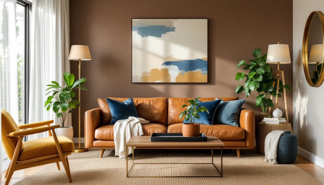
Brown isn’t boring, it’s the color of espresso, caramel, aged leather, and reclaimed wood. When done right, a brown living room feels grounded, sophisticated, and effortlessly warm. The trick is avoiding the outdated “brown couch, beige walls” trap and instead layering shades, textures, and strategic pops of contrast. Whether someone’s working with a chocolate sectional they love or starting from scratch, brown offers a surprisingly versatile palette. This guide covers everything from choosing the right shade to pairing it with complementary tones, furniture, and lighting, without turning the room into a dim cave.
Brown anchors a space without overwhelming it. Unlike stark white or cool gray, brown tones introduce natural warmth that makes a living room feel lived-in rather than staged. It’s inherently neutral, meaning it plays well with nearly every other color on the wheel, from soft blues and sage greens to burnt orange and deep plum.
From a practical standpoint, brown hides wear better than lighter neutrals. Leather sofas develop patina instead of stains. Walnut or oak flooring camouflages scratches. Chocolate-toned upholstery forgives pet hair and daily use, which matters in high-traffic spaces.
Brown also brings an organic quality that connects indoor spaces to the outdoors. Natural materials like wood, rattan, jute, and stone all lean into earthy brown tones, creating cohesion without forcing a theme. It’s a foundation that works across design styles, modern farmhouse, mid-century, industrial, even minimalist, as long as the shade and finish align with the overall aesthetic.
Not all browns are created equal. The wrong shade can make a room feel dated or oppressive, while the right one sets the tone for everything else.
Lighter browns, taupe, tan, camel, and sand, work well in smaller living rooms or spaces with limited natural light. They keep walls from closing in and pair easily with white trim and pale wood floors. Taupe, especially, acts as a warmer alternative to gray and complements brushed nickel or brass fixtures.
Mid-tones, mocha, chestnut, and cognac, offer more depth without going full dark. These shades shine in medium-sized rooms with moderate light. A cognac leather sofa or mocha accent wall adds richness without requiring a complete lighting overhaul.
Deep browns, espresso, chocolate, and walnut, create drama and intimacy. They’re ideal for larger living rooms or spaces with abundant natural light. Dark wood paneling, charcoal-brown painted walls, or a deep sectional can ground a high-ceilinged room. But they demand balance: pair them with lighter rugs, cream upholstery, or reflective surfaces to avoid a cave effect.
Undertones matter just as much as shade. Cool browns with gray undertones suit modern or industrial spaces. Warm browns with red or yellow undertones fit farmhouse, rustic, or traditional styles. Test paint samples on multiple walls and observe them at different times of day before committing.
Brown thrives on contrast. Left alone, it flattens. Layered with the right colors and textures, it becomes dynamic.
Classic pairings include:
Texture is equally critical. Brown-on-brown works when the finishes vary:
Avoid matching shades too closely, tan walls with a tan sofa in the same finish reads flat. Introduce contrast through tone, texture, or sheen.
Furniture in a brown living room should either complement the palette or provide contrast, never fade into it.
Sofas and sectionals in brown leather or fabric are investment pieces. Top-grain leather ages beautifully and suits traditional or industrial spaces. Bonded leather is budget-friendly but prone to peeling: avoid it for high-use rooms. Linen or cotton blends in taupe or mocha offer a softer, casual look. For a bold move, skip the brown sofa entirely and go with a charcoal, cream, or even deep green sectional against brown walls or floors.
Coffee tables and side tables in contrasting materials break up the brown. A glass-top table with metal legs adds airiness. A whitewashed or light oak coffee table lightens the palette. For a cohesive look, choose mid-tone walnut or acacia, but vary the leg style, hairpin, tapered, or turned, to add visual interest.
Media consoles and shelving in dark walnut or espresso anchor the room, especially if the walls are lighter. Open shelving in natural wood lets you style with colorful books, ceramics, or plants, preventing the brown from becoming oppressive.
Accent chairs are where many designers inject color. A mustard velvet chair, a navy wingback, or a blush armchair creates a focal point and keeps the room from skewing too monochrome.
When mixing wood tones, stick to two or three finishes max. Combining light oak, medium walnut, and dark espresso in the same sightline can look chaotic unless there’s a unifying element, like matching hardware or a consistent undertone.
Accessories bring personality and prevent a brown room from feeling one-note.
Rugs define zones and add texture. A jute or sisal rug reinforces the earthy vibe. A patterned rug with cream, rust, and navy introduces color while staying grounded. In smaller rooms, a light-colored rug (cream, ivory, or pale gray) prevents the brown from overwhelming.
Throw pillows and blankets are the easiest way to test color combinations. Layer pillows in varying textures, linen, velvet, faux fur, and mix patterns (stripes, geometric, solid) in complementary hues. A chunky knit or waffle-weave throw in cream or charcoal adds cozy contrast.
Artwork and mirrors break up large brown walls. Black-and-white photography, botanical prints, or abstract art in blues and greens all work. Oversized mirrors with gold, brass, or black frames reflect light and visually expand the space, critical in darker brown rooms.
Greenery is non-negotiable. Potted plants (fiddle-leaf fig, snake plant, pothos) introduce life and contrast. Terracotta or ceramic planters in white or slate tie the look together.
Curtains should either blend or contrast. Linen curtains in oatmeal or white soften brown walls. Charcoal or navy drapes add drama against lighter browns. Avoid matching curtains exactly to wall color, it flattens the space.
Decorative objects, ceramic vases, wood bowls, metal trays, add layers. Vary heights and group in odd numbers (threes or fives) on coffee tables and shelves. Brass or matte black accents introduce a modern edge, while woven baskets and wood trays lean rustic.
Brown absorbs light, so layered lighting is essential to avoid a dim, closed-in feel.
Ambient lighting sets the baseline. Recessed ceiling lights (4-inch or 6-inch cans) spaced 4 to 6 feet apart provide even coverage. Use warm white bulbs (2700K–3000K) to enhance brown’s warmth. Dimmable LEDs offer flexibility for movie nights or entertaining.
Task lighting focuses on function. Floor lamps with adjustable arms work well beside reading chairs. Table lamps on side tables or consoles add pools of light and break up dark corners. Choose lamps with cream or linen shades to diffuse light, or go bold with brass or matte black bases for contrast.
Accent lighting adds drama. Track lighting or picture lights highlight artwork. LED strip lights behind floating shelves or under media consoles create a subtle glow. Uplighting with torchiere lamps bounces light off ceilings, making the room feel taller.
Natural light is critical. Avoid heavy, dark curtains that block windows. Use sheer linen or lightweight cotton to filter light while maintaining privacy. In rooms with limited windows, strategically placed mirrors opposite light sources amplify brightness.
For darker brown rooms, add reflective surfaces: glass table tops, metallic lamp bases, or glossy paint finishes on trim. These bounce light and prevent the space from feeling heavy.
Brown living rooms work when there’s intention behind the shades, textures, and contrasts. The difference between dated and sophisticated comes down to layering, varying tones, mixing materials, and balancing light. Start with the right shade for the room’s size and light, introduce complementary colors through furniture and accents, and prioritize lighting to keep the space open and inviting. Done right, brown isn’t just neutral, it’s the foundation for a living room that feels warm, timeless, and actually lived in.